

A single product photo taken on a modern phone can weigh 5 to 10 MB. Upload four or five of those to a WordPress page without preparation, and your visitors download 30 to 50 MB just to browse one page of your store.
On a fiber connection in central Kathmandu, that might load in a few seconds, considering the server is in Kathmandu. For a customer on mobile data outside the valley, where connection quality is often inconsistent, that same page can take far longer to appear, and many of those visitors will leave before it finishes. According to HTTP Archive data, images account for roughly 36 to 40 percent of a typical webpage’s total size, and that percentage climbs much higher on image-heavy pages like product catalogs and portfolios.
This guide covers seven practical ways to optimize images for faster loading, from picking the right file format to measuring the results in Google’s own tools. Every step works whether you run a WordPress blog, a WooCommerce store, or a custom-built site. If your site is still slow after working through these steps, the cause is often elsewhere; sometimes the real issue is that you’ve outgrown your current hosting plan, not your images.
Why You Should Optimize Images for Faster Loading
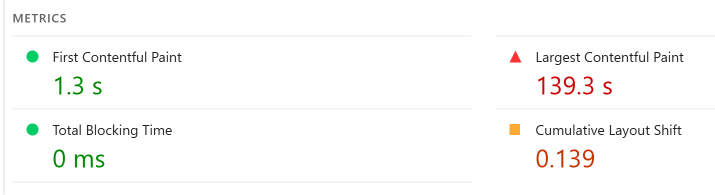
Google’s Core Web Vitals use a metric called Largest Contentful Paint (LCP) to measure how quickly the main content of a page becomes visible. The threshold for a “good” LCP score is 2.5 seconds or less. Above 4 seconds, Google considers the page “poor,” and that classification can directly affect your search rankings.
On most pages, the largest contentful element is an image. A hero banner, a featured product shot, a blog post’s cover photo: whichever image dominates the visible area when the page first loads is usually what determines your LCP score. Heavy, unoptimized images push that number up fast.
The Real Cost of Heavy Images in Nepal
Beyond rankings, there is a real financial cost for your visitors. Nepal Telecom’s data packs range from roughly Rs. 10 per GB on the largest bulk packs to Rs. 25 to 30 per GB on the small day passes many casual users actually buy. A visitor browsing five pages of an image-heavy site on mobile data could burn through 100 to 200 MB in a single session if those images are uncompressed.
With 4G covering approximately 86 percent of broadband users as of early 2026, most of your Nepali audience is on mobile. Connection quality outside the Kathmandu Valley remains inconsistent, which means every kilobyte of image weight translates into both slower loading and higher cost for the people you are trying to reach.
Choose the Right Image Format
Not all image formats are equal. Picking the right one is one of the fastest ways to optimize images for faster loading, even before you touch compression settings.
When to Use JPEG, PNG, WebP, and AVIF
JPEG works well for photographs and images with many colors and smooth gradients. It supports lossy compression (meaning some data is permanently removed to shrink the file), which makes it good for photos where a small loss in detail is invisible to the human eye.
PNG is the right choice when you need transparency (like a logo with a transparent background) or when you need pixel-perfect sharpness on graphics with hard edges and text. PNG files are larger than JPEGs for photographs because PNG compression is lossless by default.
WebP is a modern format developed by Google that handles both photographs and graphics with transparency. It produces files roughly 25 to 35 percent smaller than equivalent JPEGs at similar visual quality. Browser support is effectively universal in 2026, at over 97 percent globally.
AVIF pushes compression even further, often producing files 50 percent smaller than JPEGs. It supports transparency, animation, and HDR color. Global browser support sits at approximately 93 to 95 percent, which is high enough for production use with a fallback for older browsers.
SVG is a vector format for logos, icons, and simple illustrations. Because SVGs are code rather than pixel data, they scale to any size without losing sharpness and weigh almost nothing compared to raster images.
Quick Format Comparison Table
| Format | Best For | Transparency | Typical Savings vs JPEG | Browser Support |
|---|---|---|---|---|
| JPEG | Photos, complex images | No | Baseline | Universal |
| PNG | Logos, graphics with transparency | Yes | Larger than JPEG for photos | Universal |
| WebP | Photos and graphics | Yes | 25 to 35% smaller | 97%+ |
| AVIF | Photos and graphics | Yes | Up to 50% smaller | 93 to 95% |
| SVG | Icons, logos, illustrations | Yes | N/A (vector format) | Universal |
For most WordPress sites, converting your images to WebP is the practical sweet spot right now. It offers major file size savings with no compatibility concerns. If you want to go further, serve AVIF with a WebP fallback using the <picture> element (covered in step 5).
Resize Images Before Uploading
A common mistake, especially with phone photos: uploading the original image at its full resolution and letting the browser scale it down. Your phone might capture a photo at 4000 x 3000 pixels. If your blog’s content area is 800 pixels wide, the browser downloads the full 4000-pixel image and then shrinks it to fit. All those extra pixels are wasted bandwidth.
How to Find the Right Dimensions
Check your website’s content area width. In most WordPress themes, the main content column is between 700 and 1200 pixels wide. For a full-width hero image, 1200 to 1600 pixels is usually sufficient. Product thumbnails in a grid rarely need more than 400 to 600 pixels.
Before uploading, resize your images to match these dimensions. You can do this with:
- Your operating system’s built-in tools (Photos app on Windows, Preview on macOS)
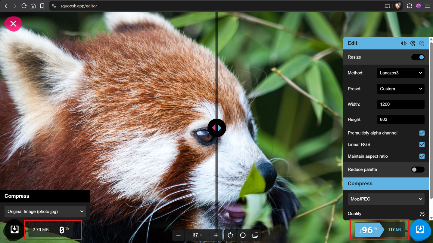
- Free online tools like Squoosh, which runs entirely in your browser
- Image editing software like GIMP (free) or Photoshop
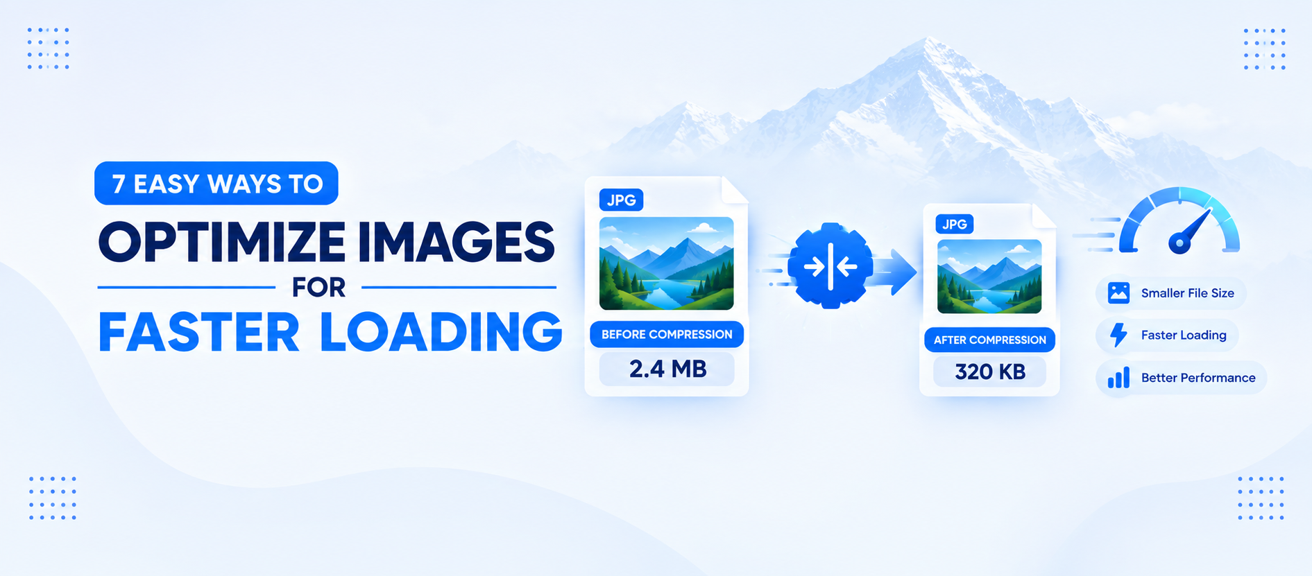
A 4000 x 3000 JPEG that weighs 8 MB might drop to 200 to 300 KB once resized to 1200 x 900 and saved at reasonable quality. That single step, resizing before uploading, often reduces file size by 90 percent or more.
Compress Images Without Losing Quality
Resizing gets rid of unnecessary pixels. Compression goes a step further by reducing the data in each remaining pixel, stripping metadata (camera settings, GPS coordinates, color profiles), and optimizing how the file is encoded.
There are two types of compression:
Lossy compression permanently removes some data to achieve smaller files. At moderate settings (around 75 to 85 percent quality for JPEG), the visual difference is usually invisible to the human eye, but the file might be 60 to 80 percent smaller.
Lossless compression removes redundant data without touching image quality at all. The savings are smaller (typically 10 to 25 percent), but the output is pixel-identical to the original.
For photographs on a website, lossy compression at a reasonable quality level is almost always the right call. Reserve lossless for graphics and logos where every edge matters.
Free Tools for Image Compression
Squoosh is a free, browser-based tool from Google Chrome Labs. It processes images locally in your browser (nothing gets uploaded to a server), supports format conversion to WebP and AVIF, and gives you a side-by-side preview so you can see exactly how compression affects quality. No account required, no file limits.
TinyPNG (which also handles JPEG, despite the name) lets you drag and drop up to 20 images per session, with a 5 MB per-file limit on the free web interface. If you use TinyPNG’s API through a WordPress plugin, the free tier covers 500 compressions per month.
Both tools are solid starting points and compress images to produce incredible results. Squoosh gives you more control over quality settings and format conversion. TinyPNG is faster for batch processing if you just need to shrink a handful of JPEGs quickly.
WordPress Plugins That Compress Automatically
If you want images compressed the moment you upload them to your Media Library, several WordPress compression plugins handle this automatically:
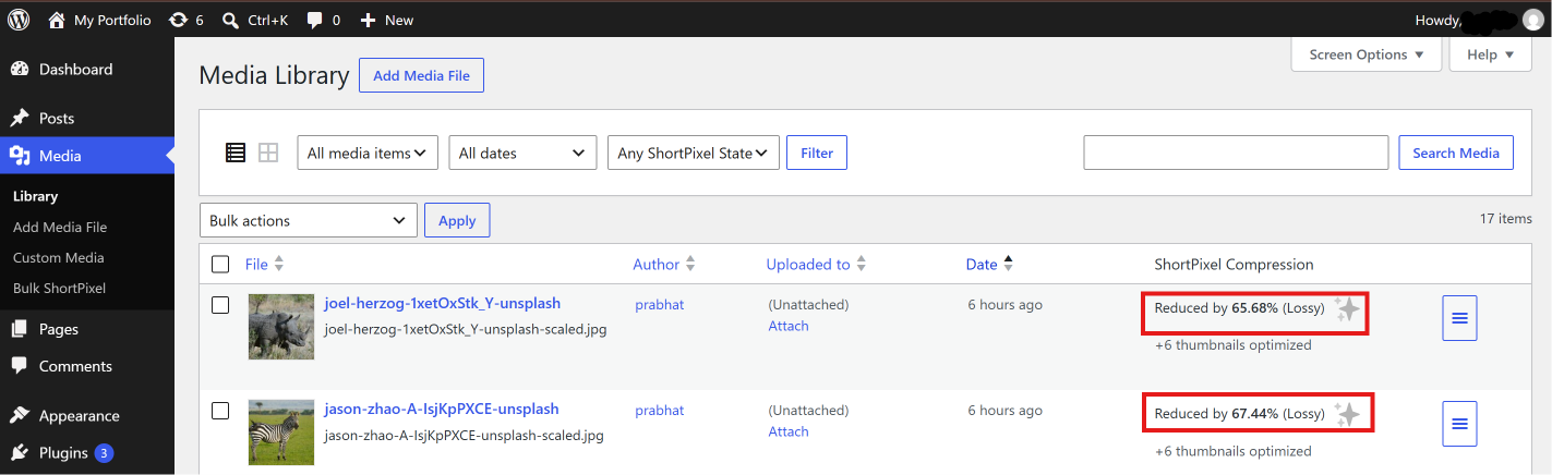
ShortPixel offers 100 free compressions per month and supports WebP and AVIF conversion. It compresses images on ShortPixel’s servers, so it works on any hosting plan regardless of server resources.
EWWW Image Optimizer performs lossless compression directly on your server for free, with no monthly limit. Lossy compression and format conversion require a paid plan.
Imagify provides a clean interface and integrates tightly with the WP Rocket caching plugin. The free tier includes 20 MB per month, which covers roughly 200 images.
Use only one image optimization plugin at a time. Running multiple plugins that perform the same task can cause conflicts and double-processing that actually slows your site down.
Use Lazy Loading for Below-the-Fold Images
Lazy loading delays the download of images that are not visible on screen until the visitor scrolls to them. Instead of loading all 20 images on a page at once, the browser loads only the two or three visible in the viewport, then fetches the rest as needed.
The result: your page’s initial load time drops significantly because the browser has far less data to download upfront.
How Lazy Loading Works in WordPress
Since WordPress 5.5 (released in August 2020), native lazy loading is built into WordPress core. The system automatically adds loading="lazy" to <img> tags that include width and height attributes. You do not need a plugin for this basic functionality, and it remains active in current WordPress versions.
There is one critical rule: never lazy-load the image that appears above the fold. That is usually your hero image, your featured image, or whatever is visible before the visitor scrolls. Lazy-loading your LCP image forces the browser to wait before fetching the most important visual element on the page, which directly hurts your Core Web Vitals score.
WordPress handles this reasonably well by default, skipping lazy loading for the first image in post content. If you need more control, performance plugins like LiteSpeed Cache or WP Rocket let you exclude specific images from lazy loading.
For sites not built on WordPress, add the attribute manually to your image tags:
<!-- Above-the-fold image: load eagerly (default behavior, no attribute needed) -->
<img src="hero-banner.webp" alt="Store homepage banner" width="1200" height="600">

<!-- Below-the-fold images: lazy load -->
<img src="product-01.webp" alt="Blue cotton t-shirt" width="600" height="600" loading="lazy">
<img src="product-02.webp" alt="Red running shoes" width="600" height="600" loading="lazy">
Always include width and height attributes on your images. Without them, the browser cannot reserve space for the image before it loads, which causes the page layout to shift as images appear. That layout shift hurts another Core Web Vitals metric called Cumulative Layout Shift (CLS).
Serve Responsive Images
Serving the right size to each visitor is another way to optimize images for faster loading. A visitor on a phone with a 375-pixel-wide screen does not need the same 1200-pixel image you serve to desktop users.
The srcset and picture Approach
The srcset attribute tells the browser about different sizes of the same image:
<img
  src="product-800.webp"
  srcset="product-400.webp 400w, product-800.webp 800w, product-1200.webp 1200w"
  sizes="(max-width: 600px) 400px, (max-width: 1024px) 800px, 1200px"
  alt="Handmade wool scarf"
  width="1200" height="800"
  loading="lazy">
The browser reads the sizes attribute to determine how wide the image will be displayed, then picks the smallest file from srcset that covers that width. A phone user downloads the 400-pixel version. A desktop user gets the 1200-pixel version. Same image, right size for each device.
The <picture> element goes further by letting you serve different formats with automatic fallback:
<picture>
  <source srcset="product.avif" type="image/avif">
  <source srcset="product.webp" type="image/webp">
  <img src="product.jpg" alt="Handmade wool scarf" width="1200" height="800" loading="lazy">
</picture>
A browser that supports AVIF downloads the smallest file. One that does not falls back to WebP. The oldest browsers get the JPEG. No visitor sees a broken image.
WordPress themes with good responsive image support generate multiple sizes automatically when you upload an image and insert the correct srcset attributes in your HTML. Check your theme’s documentation or inspect your page source to see if this is already happening.
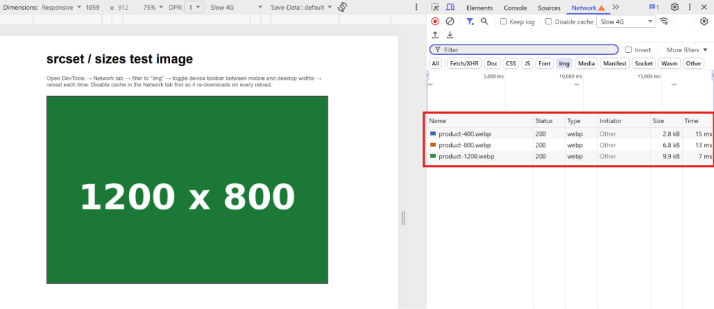
The browser’s Network tab reveals which image size was actually downloaded for the current viewport width
Optimize Image SEO
Optimizing images for speed is half the picture. The other half is making sure search engines can understand what your images show, which helps your pages rank in regular search results and brings additional traffic through Google Images.
File Names, Alt Text, and Captions
File names should describe the image content using plain words separated by hyphens. Rename IMG_20260901_143522.jpg to something like handmade-wool-scarf-nepal.jpg before uploading. Search engines read file names as a relevance signal.
Alt text (the alt attribute on an <img> tag) serves two purposes: it tells screen readers what the image shows, making your site accessible to visually impaired visitors, and it gives search engines a text description of the image content. Write alt text that is short, literal, and descriptive. “Red running shoes on a white background” is useful. “Best shoes buy now click here” is not.
In WordPress, you can set alt text in the Media Library when you upload an image, or in the block editor when you insert one into a post.
Captions (the visible text below an image) are optional, but they get read more often than body text. Use them when a caption adds genuine context that is not obvious from the image itself.
Title attributes on images are largely ignored by search engines and invisible to most visitors. They are not worth spending time on unless your content management system fills them in automatically.
Measure Your Results
Optimization without measurement is guesswork. After applying the steps above, test your pages to see what changed and where room remains.
Google PageSpeed Insights and Lighthouse
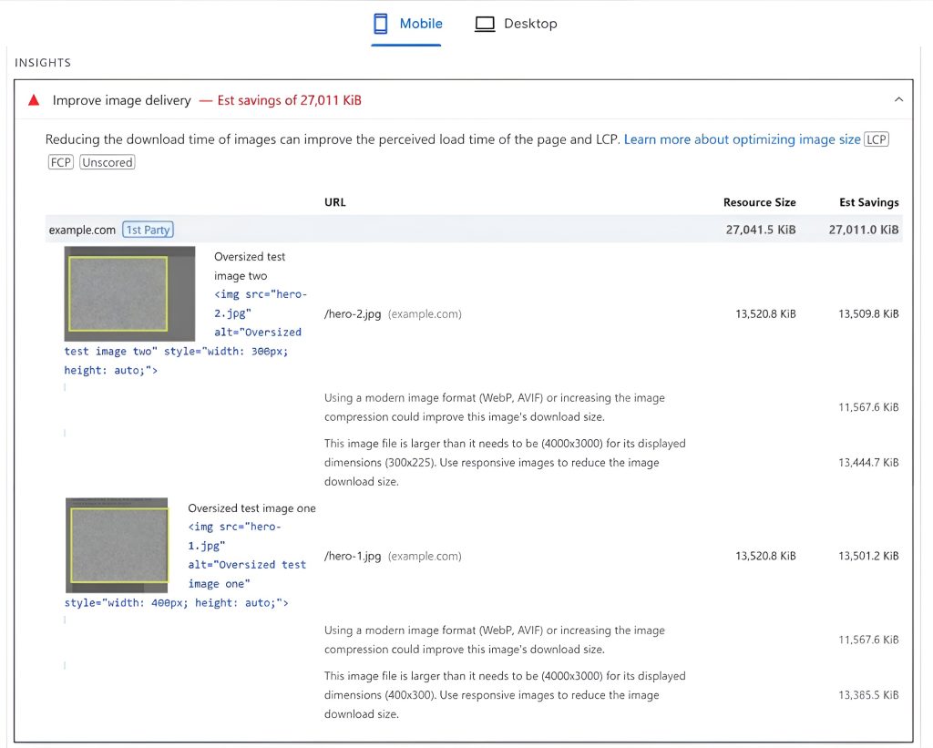
Google PageSpeed Insights is the fastest way to check. Enter your URL, and it returns both lab data (simulated load) and field data (real user experience from Chrome users who visited your site). The report flags specific images that could be resized, compressed, or converted to a more efficient format, along with estimated byte savings for each one.
Lighthouse, available in Chrome DevTools under the “Lighthouse” tab, runs the same analysis locally and gives you a full performance audit without sending your URL to Google’s servers.
Key Metrics to Watch
Largest Contentful Paint (LCP): Measures when the largest visible element finishes rendering. For most pages, this is an image. Target: 2.5 seconds or less.
Total page weight: The combined size of everything the page downloads. Check the Network tab in Chrome DevTools, sort by size, and look at how much of the total comes from images. After optimization, images on a well-tuned page typically account for less than 500 KB total.
Number of image requests: Each image is a separate HTTP request. Fewer, right-sized images load faster than many small ones, though lazy loading mitigates this for below-the-fold content.
Run PageSpeed Insights before and after your optimization work. Screenshot the results, so you have a concrete record of the improvement.
Putting It All Together: How to Optimize Images for Faster Loading Every Time
Here is a practical workflow you can follow every time you add images to your site:
- Resize the image to match your content area width before uploading.
- Convert to WebP (or AVIF if your setup supports it).
- Compress using Squoosh, TinyPNG, or a WordPress plugin.
- Rename the file with a descriptive, hyphenated name.
- Upload to WordPress and fill in the alt text field.
- Check that lazy loading is active on below-the-fold images and not applied to your above-the-fold hero or featured image.
- Test the page in PageSpeed Insights and fix any remaining image-related warnings.
Conclusion
This workflow to optimize images for faster loading adds maybe two to three minutes per image compared to uploading straight from your phone. The payoff is a faster site, lower data costs for your visitors, better search rankings, and fewer people leaving because your page took too long to load.
Image weight is only one piece of the performance puzzle. The server behind your site matters too. A web hosting provider like Kailash Cloud offers plans that run on Nepal-based LiteSpeed servers with NVMe SSD storage, covering the server side of the same speed equation that image optimization addresses on the content side.